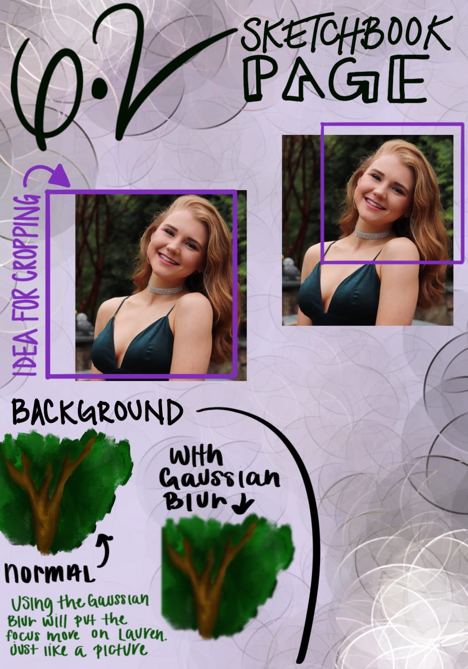
This is the second page for my sixth project. In this sketchbook page, I played around with the background and the cropping of the image. For the background I wanted to mimic the reference picture in a way. So I played around with the blurring effects in Procreate to see what I could do. In the reference photo, the picture was taken in the “Portrait” setting, making the background out of focus. By using the Gaussian Blur, I was able to blur out the example trees. When I draw the photo, I think I am going to go with the crop idea on the left.
I like how the purple compliments the skintone in the picture -. Are you going to do anything experimental for the background?