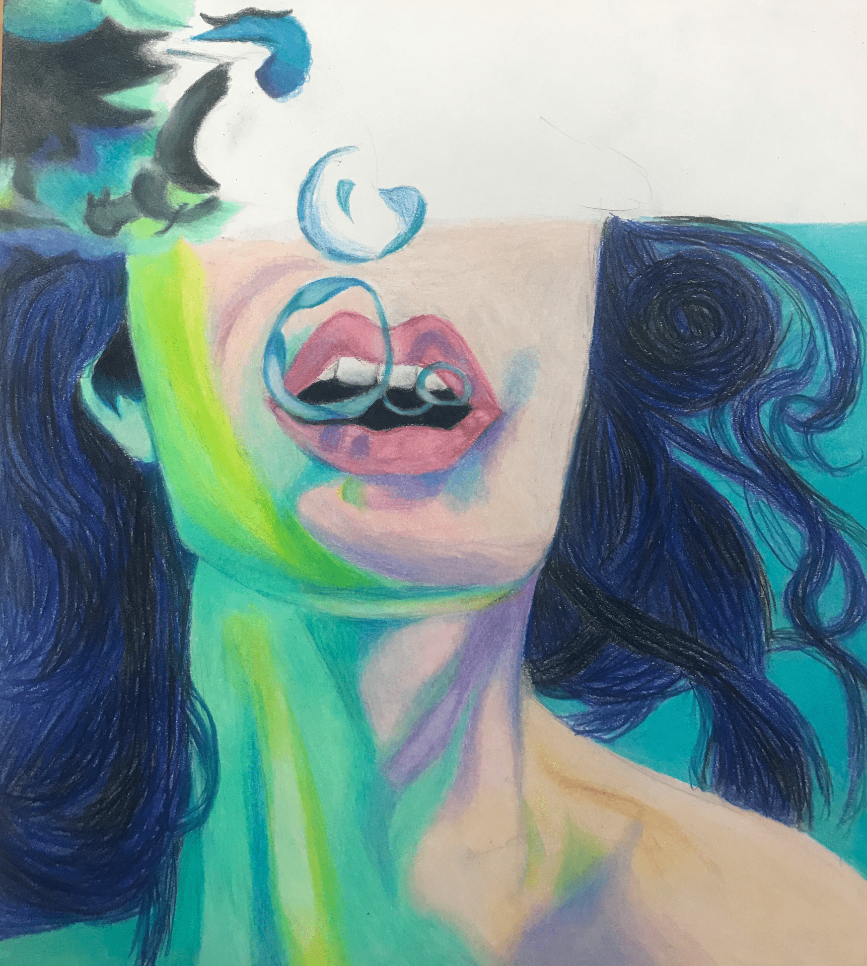
I have finished over half of this piece so far. I trying to illustrate the surface of the water at the top of the page. I tried to over emphasize the colors on the woman because I wanted to almost look like she was starting to drown. I ended up doing this piece in color pencil rather than acrylic because I wanted to have sharper details. I’m pretty proud of how it has turned out so far.
This looks amazing! I think you depicted the air bubbles really well. I’m always hesitant of doing underwater scenes because of how irregular and dynamic it is, but you’re executing it really well. The yellows and greens do make the piece look more dramatic, and even a little abstract, which is very cool. Nice job!
~ Emma P.
This piece is extremely dynamic, and the colors are spot on. I like how the face is cut off it gives it a surreal anonymity, so you can really imagine yourself drowning with her… that sounds bad, but it’s actually really hard to do. You should definitely be proud.
Maybe blur her face at the top to keep that anonymity.