Artwork #7 progress

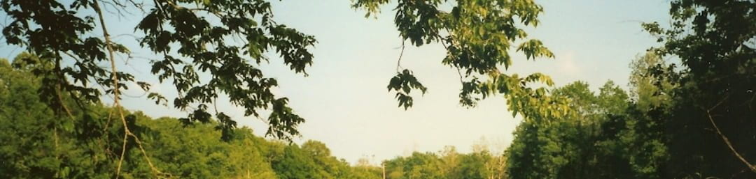
For this artwork, I based it off what I learned from my artwork #6 and took it in a slightly different direction. I used images with the same color palette as the last artwork and I like how the earthy greens and browns give it a vintage feel. Unlike my last piece with just one photo, I used several photos layered on top of each other like a collage. Sadly,…

Artwork # 5

My next artwork is based on my last two sketchbook spreads. The painted background turned out a little different and a little darker but I like how it looks. To balance out all the color, I decided to cut out black in white speech bubbles instead of ones from color comics. I really like how this is coming along. For the speech bubbles, I want to arrange them more vertically…

Artwork #4

This is the start of my fourth artwork. It’s basically the same as the last two sketchbooks. Moving on from this, I want to change up the composition since it seems static and add more buildings with varying sizes. Cam also gave me a good idea to use this as a background and then put a family portrait overtop.

Artwork #1 reflection

This artwork isn’t quite finished yet but I like the direction it’s heading. It’s based on a photo my dad took in his family’s home town in Missouri. I wanted to convey a sense of nostalgia and youth. I used more muted, calming colors in order to achieve that effect. I added some wildflowers, which weren’t in the original photo, to make the composition more interesting and I used purple…