The Captains deserve a better logo and here is why

Michaela Scott and Maggie Sheridan | Editors-in-chief
The logo selected to represent the Captains is an insult to the diversity of our school. With all the talent at our school, choosing stock art that a supposedly professional company “provided” is an insult to our students.
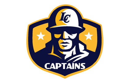
Of the six images released, five consisted only of only the word “Captains” or the initials “LC.” The sixth featured a helmeted, masculine face.
Most agree it looks more like a construction worker or baseball player. If the school is going to make such a dramatic change, it is only fair to include us in part of the decision making.
The process in choosing the new mascot was incredibly rushed due to the nature of the BLM movement and other trends; additionally, students felt like they weren’t given enough opportunity to partake in the mascot modification, according to Instagram polls on a student-run LCHS update account.

One of the newly-released Captain logos, the only so far to present a personification of the new mascot.
In the process of choosing a mascot, students and community members submitted an idea for a potential name. Then, our school’s administration narrowed the suggestions. Next, student council members chose several names which were then approved by the administration. Finally, the student body could vote on an official name from the top three selections.
The process of changing the logo was squeezed into the last few weeks before the school year, the choice had minimal student contribution, and the chosen image received immense amounts of negative feedback from unapproving students through social media.
Part of the issue comes with the challenging nature of the mascot, which is different from many teams, which have an animal. Embodying the entire student body in one human logo is a challenge.
“The Captains are really so many different things, there is no one embodiment; I saw a sweatshirt and ballcap, other people saw a soldier, others saw a fireman. It is not one primary logo, it means different things to different people,” said Principal Michelle Luttrell of the new logo.
Some argue that the mascot and logo was changed primarily to eliminate discrimination and hate against people of color; however, one image of the mascot has been countlessly categorized as appearing to embody a white military man. Many students have spoken out through social media and have taken a position on this issue which prevents further diversity through the school.
One particular post on Instagram relating to the logo has over three hundred comments, most of them complaining about it. One comment says, “It looks like we are being represented by a construction worker.” Another says, “If they wanted to pay homage to our NJROTC program, why is the logo an Army captain and not a naval captain?”
Luttrell has made it clear that this militaristic image isn’t the only current logo, however it is the most commonly presented graphic, it is the only personification of the mascot, and has drawn the most attention. “I’ve actually had a number of people come to me and say it actually looks like an African-American man,” said Assistant Principal Mark Patterson.
It also appears as though the image of the man was taken directly from Shutterstock, a stock photo site, as “soldier,” and is not an original logo.
“That image was one of the last ones a vendor had sent forth. We chose it with the understanding that it was not going to be the logo that defined the school,” Luttrell said.
Although the logo of the male is the one that has drawn the most attention, different groups within the school are using different logos. “I think Athletics is using it more so than any other group,” Luttrell said. “Other groups on campus are using some of the other logos when they’re putting out formal communication or creating spirit wear,” said Luttrell.
Another cause of concern amongst students was the lack of student involvement. They felt as though they did not have a say in choosing the logos and it was a surprise to everyone. When making big decisions for the school, they would like to be included or have their input heard.
When asked if they would let students help with design ideas for the logo, Administration seemed open to suggestions and said that could be a topic of discussion with the Student Council, but the last time the student body designed something for the school was back when the original mascot was designed and it was the embodiment of Moseby’s Raiders. However, they agree it is certainly something to revisit with Student Council members and take into consideration.
“When schools select new mascots in Loudoun County, it has just been a practice that language and possible mascot ideas are usually just sent to vendors so that we can do some mock ups and have options from the vendors for consideration,” Luttrell said. “We just received submissions to choose from.”
The main issue is really just the fact that students had no choice but to be okay with this image. We have many talented art students at our school, and many would be more than willing to submit possible ideas for a logo that would better suit the school.
Student involvement is the key to success and shouldn’t be underestimated. The school should let us brainstorm logos that would better fit the school as a whole.


